Hello Everyone!!

Finally I am back to blogging after 6 days of inspirational and rejuvenating holidays in Bangkok 😀

Today I am going to write about the currently trending: DIP DYE ITEMS.

Some trends stay and some fade, but one trend that began catching on is now on fire.  Ombre aka “dipped dyed” means shaded in French. It’s all the rage from fashion to hair and now to interiors as well.

Few months back, one of my college Friend, Luanne, an avid Fashion Blogger (Weesha’s World), had dip dyed her hair in pink color…little did I know that this trend would find its way in furniture and home dĂŠcor accessories also. .  Love it!

According to me, Dip Dye trend can also be called as “Split Personality”. Because the same furniture piece can have two different looks..which is great!!
The dipped look has been gaining momentum for a while now.  In fact, I’d be shocked if you haven’t already seen something dipped. Here are few of my favorite dipped pieces and items.
Dip dye Trend in Fashion…

So, what do you guys think about this trend? Its an enjoyable twist on a traditional paint makeover with just a ‘dip’ of unexpected colour. It’s a fun and easy-to-do treatment at home with stunning results. These were several ideas on ways to decorate with dip-dyed accessories and furniture.

Would you do this to any of your furniture or accessories?? Do leave your comment below 🙂

Hello friends!

Today I am going to enlighten you with some of the latest summer styles that’s trending these days in basically all the types of industries. I’ve been seeing these trends everywhere from fashion to interiors and in the work of some of today’s top contemporary artists. With any trend, I recommend incorporating small touches into your own home and accessories and artwork are a great way to do this.

Below are the mood boards I put together of all of the things I’ve been inspired by lately and also some ideas for how you can incorporate this look into your own home! I hope you find this as inspiring as I do!

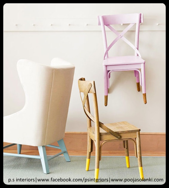
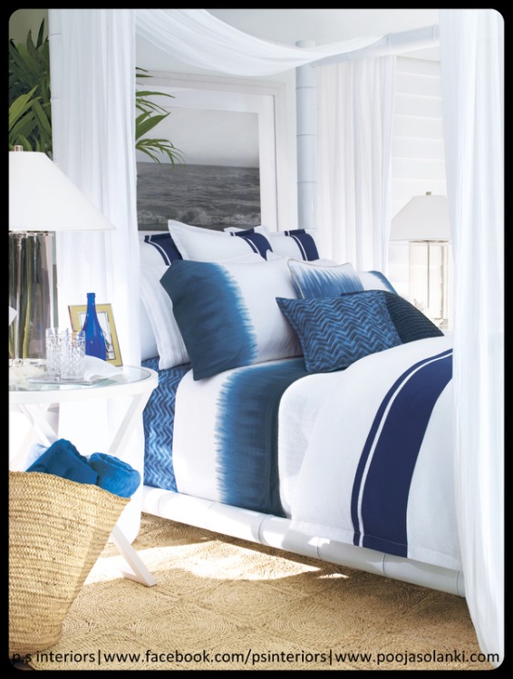
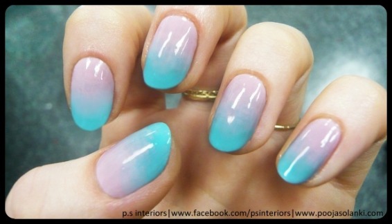
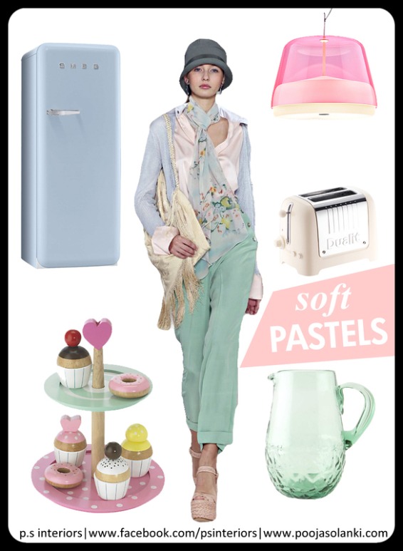
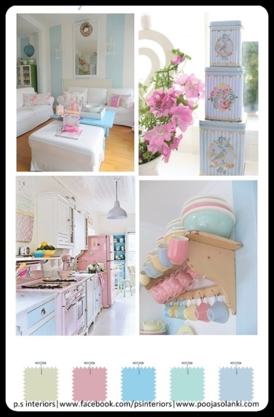
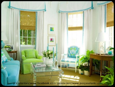
1) Starting with PASTELS…This year, pastels are all the rage.  We’ve already seen them on the runways in spring fashion collections, but did you know pastels will be big for interiors, too?  A complete 180 from the dark greys and heavy wood tones that have dominated the interior scene lately, this spring we’ll see things freshen up with light shades of our favorite colors.  The trick?  Keeping it contemporary.
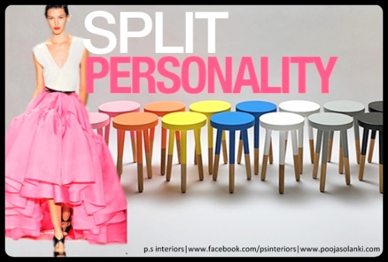
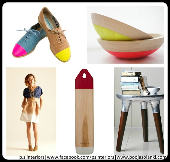
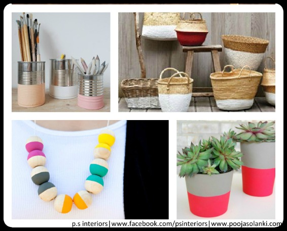
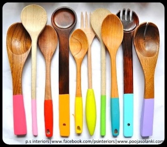
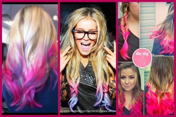
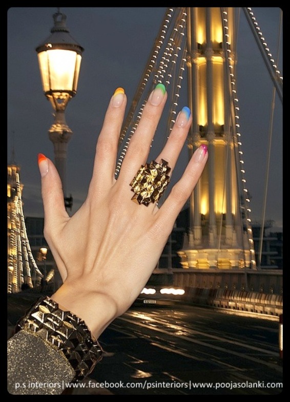
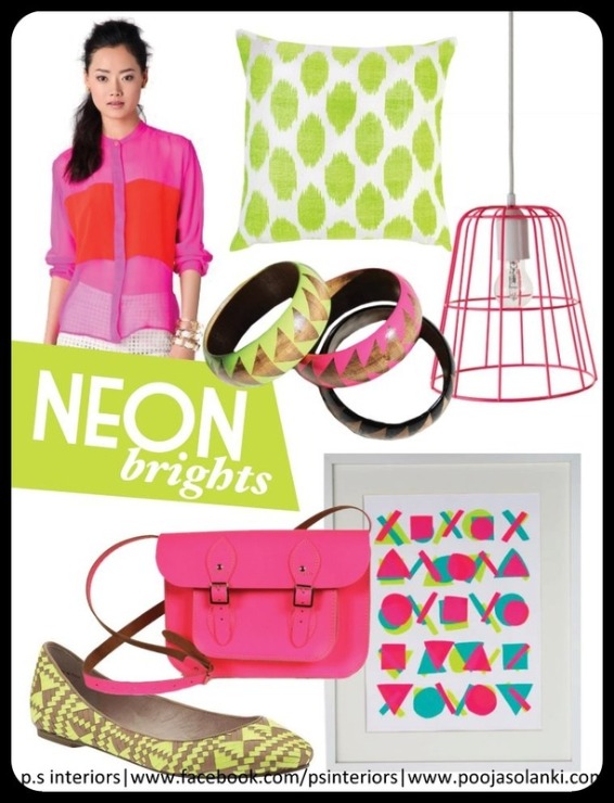
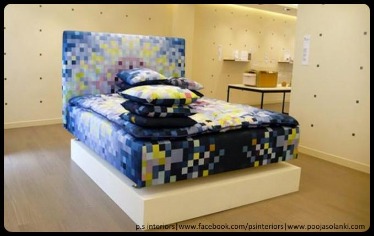
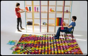
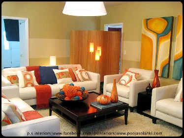
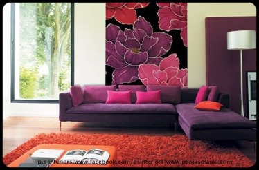
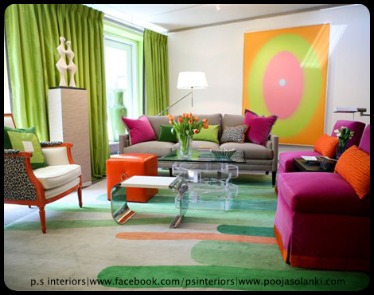
2) NeoN Brights….Bright and Funky, everyone needs a little neon in their life at some point don’t they? I am really loving bright pops of colour right now, from my electric blue skinny jeans to the gorgeous HELLO KITTY lipstick I recently purchased in the hottest pink.
Here you have an eclectic mix of bold and bright neon colours, very kitsch and quirky, I can see this working really well against a stark, white backdrop, or perhaps something more urban and industrial.
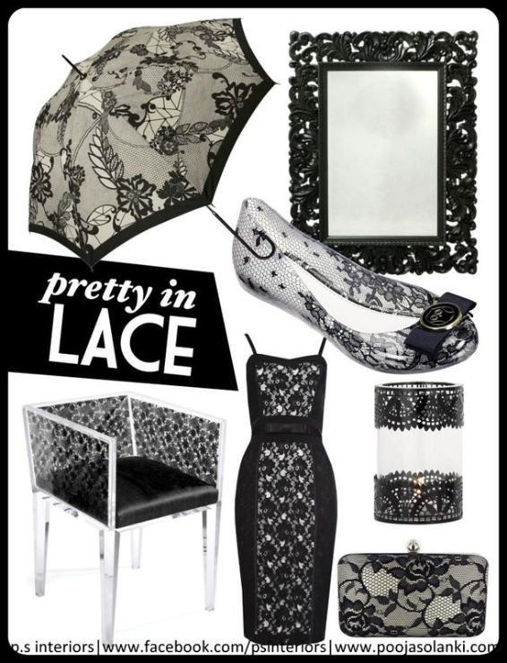
3) Pretty in Lace…With a provocative and sweet feel, it’s no surprise that lace has become the ultimate must-have this season. From dark and edgy to vintage and soft, the versatile, ornate fabric can do no wrong. We’ve seen this trend on a variety of looks this season ranging from tops and skirts, to gloves and jewelry and now to INTERIORS as well..
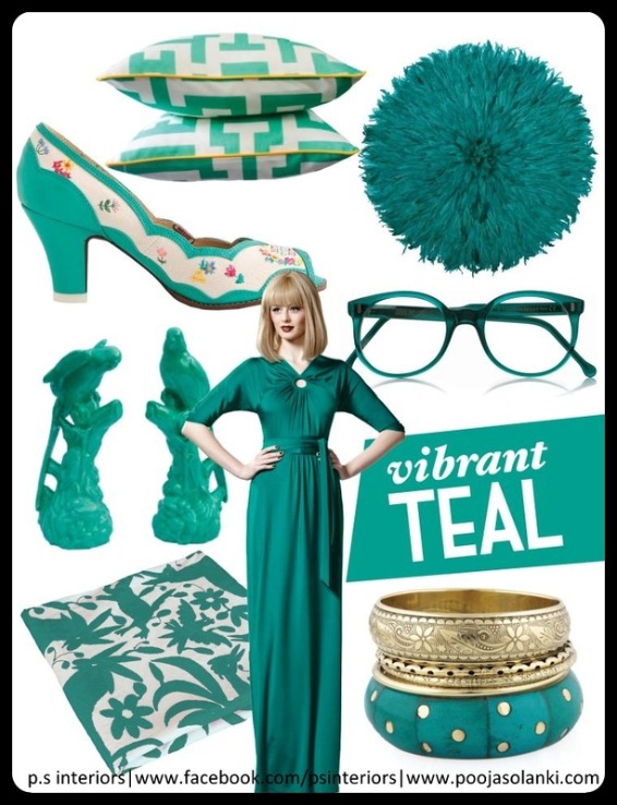
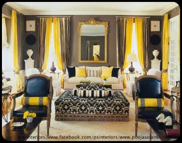
4) TEAL color…..This is not your ordinary teal. This is a stand-out, warmly tinted, wildly refined, deep teal. Neither green nor blue, silent nor shocking, deep teal pauses in a perfect middle-ground aesthetic that will turn heads and feel just right at home or in your closet…
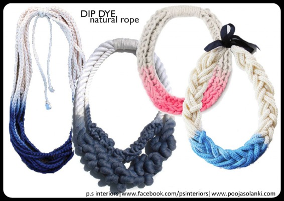
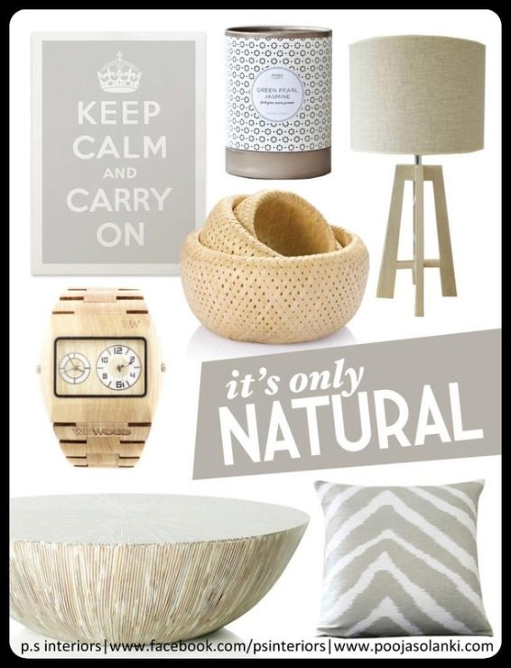
5) NATURAL…There is something to be said about the timeless looks of a neutral palette in INTERIORS or FASHION. One of the current trend, of course, were the so-called “neutral” colors: beige, nude, flesh-colored, and shades of powder or sand and similar to them palette of semitones.
The naturalness, innocence, tenderness – that’s what designers remind us in their spring collections. This applies to evening dresses and to casual wear, to lingerie and shoes, to handbags and all other kinds of accessories and home decor.
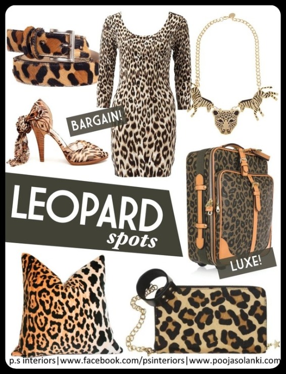
6) LEOPARD…..Leopard, leopard and more leopard is all that we are seeing from last few seasons.  Leopard is the popular trend in prints and textiles.  It is also used in just about every apparel piece, shoe, watch, and even nail art this season. It has started its trend in home interiors as well from floor rugs to throw pillows and beyond.
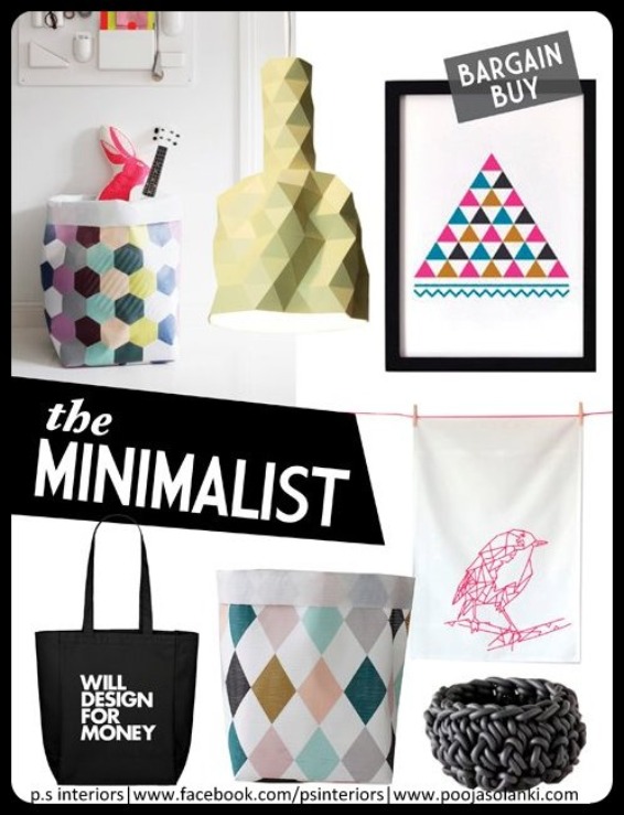
7) MINIMALIST….Minimalism is a trend that has been used in interior design and architecture. Minimalist design has been highly influenced by Japanese traditional design and architecture. The trend somehow helps you to create a smart, relaxing, clutter-free look in your home. Thus, modern minimalist pictured softer, more personal and easier to live with.
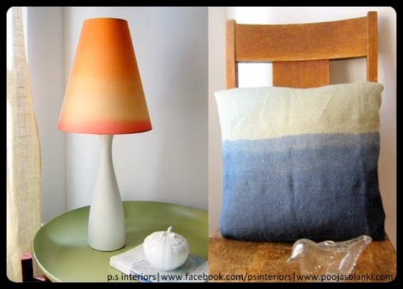
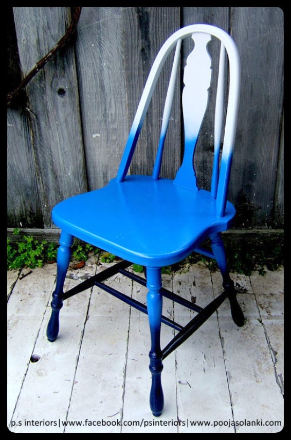
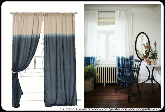
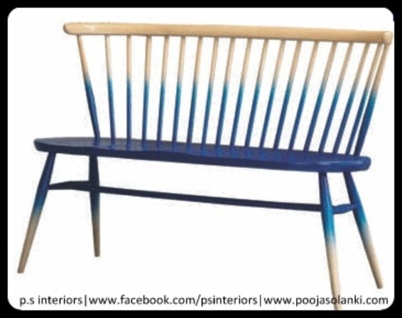
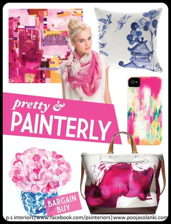
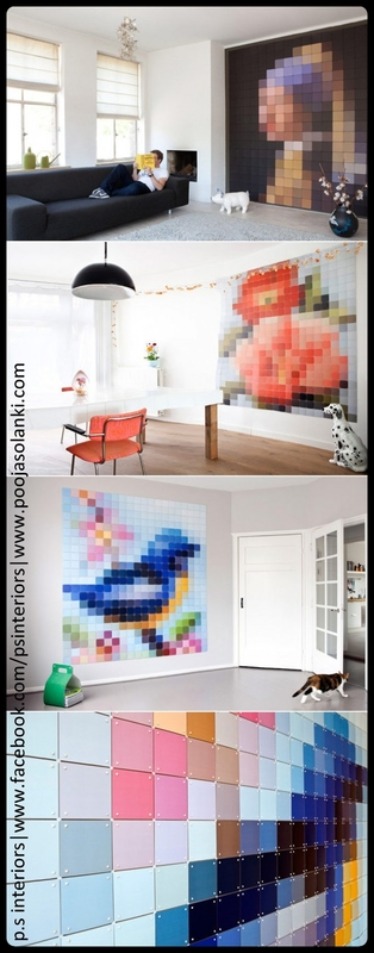
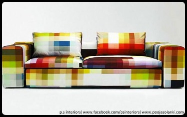
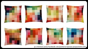
8) PAINTERLY…The new painting techniques are popping up in everything from tabletop decor and cushions to wallpaper, from mobile covers to handbags. Wide brush strokes, mural paintings and finger painting are opening up new ways to incorporate vibrant flourishes of art in our everyday lives.
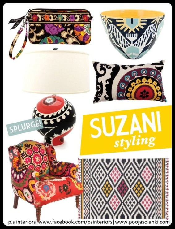
9) SUZANI…In its most general sense, the Uzbek word “suzani” means needlework. However, most suzani lovers associate the word with the intricate, beautiful, and colorful embroidery work made by women in the Central Asian country of Uzbekistan. They add great pattern and beautiful eclectic touch and can work in country, modern or vintage interiors.
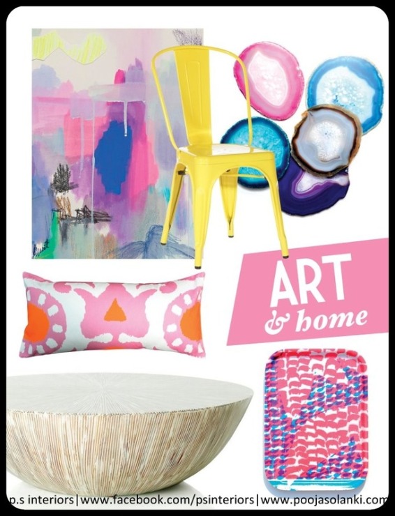
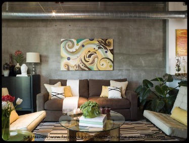
10) ART…Colorful and Abstract!!
So what do you guys think of these trends?? Please leave your feedbacks and comments below. And also tell me which one is your favorite? I LOVE, LOVE all of them 😀 * Cheers*

Hello Everyone!!

Recently, I had come across a “pixel inspired furniture piece” at THE HOTEL SHOW exhibition that took place 2 weeks back in Dubai World Trade Center.  Since then I am very fascinated with such an innovative design.  The pointillism painters were fascinated by them in the late 1800′s. Modern society measures picture quality with them. And these days, they have become a source of inspiration in decor. Pixels are now common in the design world featured as graphic prints on everything from pillows to bed-sheets to meticulously-constructed lamps and clocks. A dizzying array of designers has set their sights on this pixel-inspired trend. From furniture and lighting to tiles and textiles, items are getting cubed, bitmapped and scattered.

This enthrallment may in part be sparked by an increasingly digital world and in part by our initial fascination with dots, evident during the pointillism period in art – how a large group of many tiny dots, varying in color, can compose a larger image. Regardless, they make for funky and modern touches in our living room or bedroom and are probably a good conversation starter.

Listed below are some of the most coolest and imaginative examples of pixelated designs that I came across (Thanks to Google :)) and I promise you each and every piece will enthrall you with its creativity.

These below 8-bit inspired furniture designs are the brain-child of London-based Designer Cristian Zuzunaga. His Interior accessory store has a cool collection of pillows, rugs and couches that celebrate pixels.
Below is Pixel Hand Hanger….

Hello Everyone!!

Everyone aspires for a colorful lifestyle. People often have certain reservations on the use of colors at home. Colors carry the capacity of styling and glamorizing our homes just as perfectly as they have the power to depict our personality. My Last blog was about COLOR YOUR HOME. Here are 10 Terrific Ways to Refresh your HOME with Colors.

1. Perfect Blends:
Use colors with strong union and varying characters. For instance, combine bright colors like pink, yellow, orange with sophisticated colors like white, black, grey. The picture below is a perfect example of such a perfect blend.
2. Spotlight:
Use colored furniture as the main focus of the room and neutral colors on walls and floor, like in the below picture.
3. Spice It Up: The vigor of depth and the power of contrast can distinctively punctuate the space in a very unusual way. Check out the illustrative picture below. Its a combination of bright colors, different textures and patterns.
4. Elevated Contrast: Create a chic space by making a bold statement by using colors with a strong contrast. For instance, the picture below shows a very classy chic set up with bright yellow used in accents like cushions, accessories and detailing.
5. Colors of Nature:Using nature’s palette in a neutral setup makes up for a smart and long term choice of colors. They never get outdated and always carry a unique sense of vigor. Nature’s palette includes colors like Blues, Greens, Browns.
6. Fresh and Gentle:Create a warm and inviting space with muted, soft, subtle and sophisticated colors like browns, greys, greens and oranges, like in this picture below.
7. Synchronize with Color: Harmonious colors or colors with similar tones and shades are easy to work with. However a subtle contrast does magic in such a color scheme. Below picture uses one color Pink with its different tones and shades.
8. Classic and Crisp:Using timeless classic color combinations that could please everyone’s eyes, alongside some crispy colored focus, does wonders. As shown in below picture.
9. Assorted Colors:Try your hand on a very colorful scheme. I know it is never easy, but you can make a personal style statement with this color assortment. As shown in the below picture, totally love the combination of all the bright colors used in right places.
10. Happy Go Lucky:Create a casual but focal happy-go-lucky spot in some corner of the room as your personal colorful space. Use colors that soothe your eyes.
I hope this blog with pictures gives you better ideas about Coloring your HOME!!  * Cheers*