Hello Everyone! 🙂

I am back with blogging now. Its been really long i haven’t. This time i am going to write about mirrors. As they are one of the most important element in any space. I just recently realised that mirror can totally change the look of any room.

Not only can a mirror be a feature on a wall, it will also enhance the room by making the space feel bigger as the view it’s reflecting is effectively repeated back again. With this in mind how do you select a feature mirror for a space? Below are some tips and ideas which you can use in your home.

Firstly have a good look at the room and decide whether you’d like a floor standing mirror or one that hangs on the wall. Secondly refer to images from Pinterest and your favourite interior magazines for inspiration.

Our ‘top-tip’ is to be bold and a bit daring! Have a look at some of the ways in which you can use mirrors to create an enhanced space.

To increase space on your dressing table, hang a mirror on the wall.
This ornate, over-sized mirror creates a luxurious feel in the room, while making the space feel much bigger.
The collection of circular mirrors with gold frames helps to create a luxurious and sophisticated space.
The white-framed mirror in this bathroom is subtle and reflects the dark tiles in the bathroom.
The long mirror subtly gives the room added depth.
I hope these ideas and inspiration helps you in any way. Cheers!

Ever wondered what the top five interior design styles are? Infographic fans and design fans alike will find this descriptive style synopsis not only helpful but also fun. This cool infographic explains the difference between a “modern” and a “contemporary” design style before moving on to traditional, industrial and classic. Do you prefer clean lines or rather live in a home with floral-patterned wallpaper? Do you vibrate when you see heavy carved furniture and find yourself looking for symmetry in everything?

Then you might be the traditional type. But there’s always room for more and mixing styles is one of the hottest trends. That’s because we tend to grow and gain new knowledge, open our eyes and get attached to more than just one style – that’s what an eclectic style is for! Now that you know the trendiest interior design styles, are you curious to see the differences between bachelor & bachelorette pads in another fun infographic?

There are no hard-and-fast trules when decorating your home! Feel free to mix and match design stylesto create a look that is Eclectic – derived from multiple styles/sources and reflect your personal style.

The Chevron pattern is a bold pattern that makes a really strong impact on a room. It’s essentially a series of V’s laid out in a row. It’s a little bit wavy but with more of a hardened edge.

Despite being a bold and tough design, it’s a great choice even for the most serene of homes. If you choose the right colors and placement for a Chevron design then you can evoke that wavy, undulating relaxed feeling that lies beneath this design.

This look isn’t for everyone but it’s certainly one to try to play around with. You don’t have to commit to incorporating it into your design completely; use towels, pillows, blankets, rugs and other temporary items to test out this design.
One really beautiful way to use the Chevron pattern is in your wood flooring. The color is still neutral enough to work with any decor but it adds a pop to the room that goes beyond what you normally get from wood flooring.
Your floor doesn’t have to be wood for the Chevron pattern to work. You can get Chevron tiles, too. I like the narrower V’s in this particular tile pattern.
The curtains here have a Chevron pattern that really makes the room interesting. I think it’s a little bit much to set this pattern against striped walls, though. What do you think?
Pillows are another great temporary item that is great for playing around with the Chevron design in your home. This square-based pillow hints at that type of design. You could mingle Chevron patterned pillows with these as well as with striped pillows for a really interesting effect.
Completely love the architecture of this building. Chevron!!
Chevron in Fashion too…be it pattern on clothes or nail art.
DIY Chevron pattern on furniture.
Add in these bold patterns in your home..Be it walls, floors, cushions, furniture, rugs or in fashion!! Cheeers!!

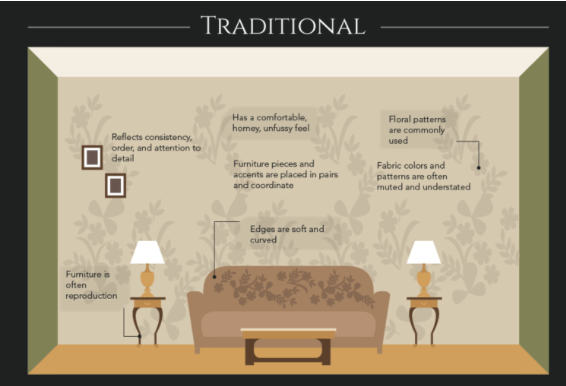
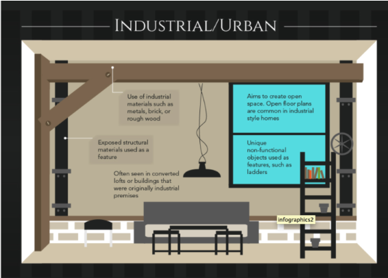
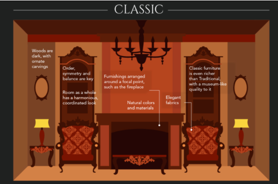
“Lively. Radiant. Lush… A color of elegance and beauty
that enhances our sense of well-being, balance and harmony.”
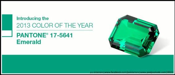
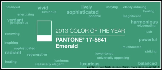
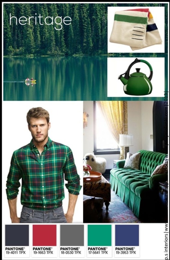
The biggest color thing that we all have been desperately waiting for….is right here! Pantone has recently announced it’s Color of the Year for 2013 – EMERALD.
Image Courtesy: Pantone
The 2012 color of the year, PANTONE 17-1463 Tangerine Tango, a spirited reddish orange, provided the energy boost we needed to recharge and move forward. Emerald, a vivid verdant green, enhances our sense of well-being further by inspiring insight as well as promoting balance and harmony.
Most often associated with brilliant, precious gemstones, the perception of Emerald is sophisticated and luxurious. Since antiquity, this luminous, magnificent hue has been the color of beauty and new life in many cultures and religions. Also the color of growth, renewal and prosperity, no other color conveys regeneration more than green. For centuries, many countries have chosen green to represent healing and unity.

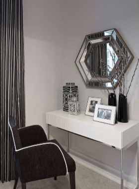
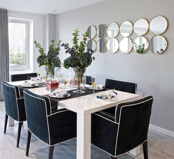
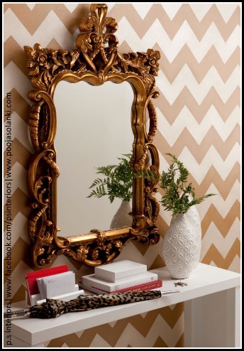
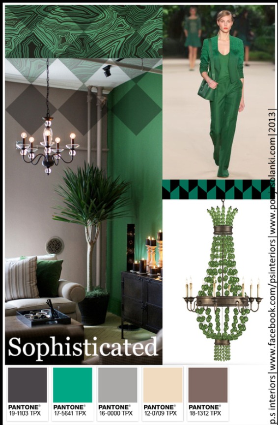
Emerald for Interiors
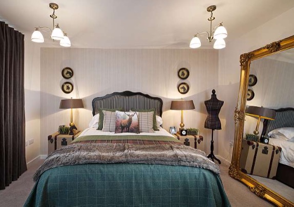
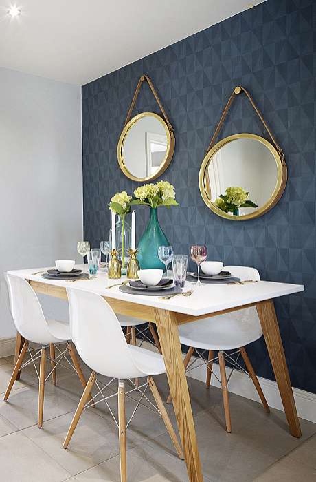
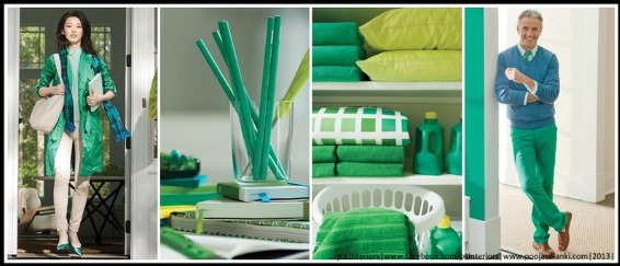
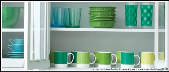
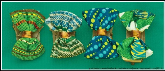
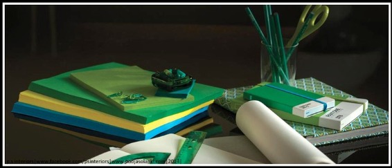
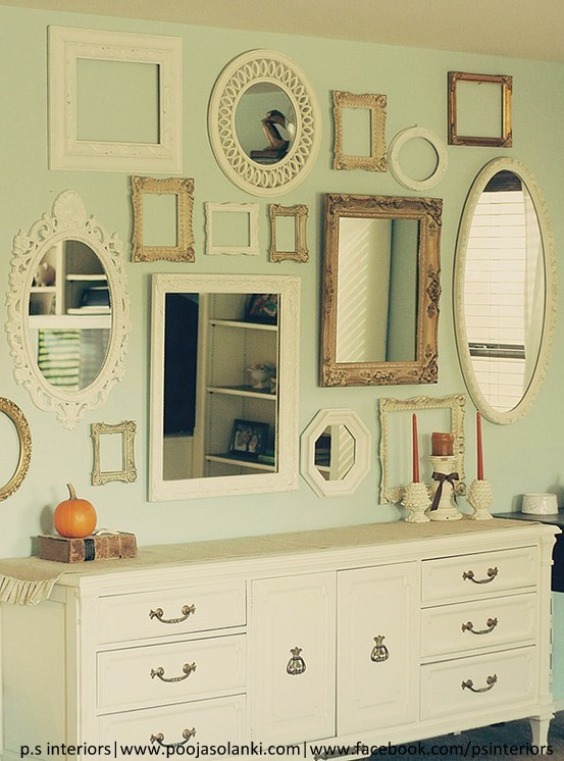
Enhance your sense of well-being at home by rejuvenating the interior with Emerald paint, accents and accessories. This jewel-like hue will create a luxurious feel in an entryway, powder room, dining room or study, and bring life to a living room as an accent wall. Add a splash of color to the kitchen and dining room areas with Emerald dinnerware, stemware and appliances.

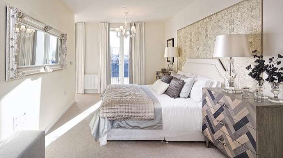
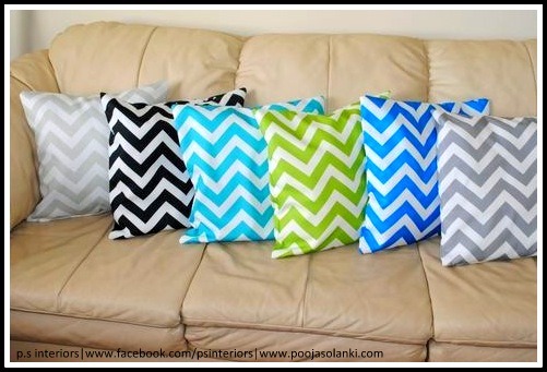
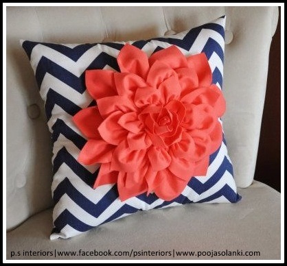
Enliven your home with Pantone bedding, pillows, bath towels and accessories.

Emerald for Fashion
The prevalence of green has been steadily rising for several seasons, especially in the fashion and couture markets, and even on the red carpet. Appropriate for every occasion, Emerald’s classic elegance makes for striking and irresistible women’s formal and everyday wear as well as accessories. Emerald also makes a strong statement in men’s sportswear, knitwear and ties. Balanced yet sophisticated, Emerald enlivens all colors in the spectrum and will continue to make a statement beyond spring and summer into fall and winter.
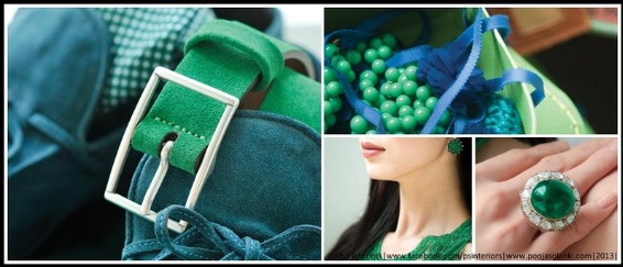
Emerald for Beauty
Equally harmonious on the cosmetic color wheel, Emerald dramatizes all eye colors as it beautifully enhances green eyes, is compatible to blue eyes, emphasizes the green undertone in hazel eyes and intensifies brown eyes to make them appear deeper. Emerald is also a perfect complement to peaches, pinks, roses, ruby reds and aubergines – offering a variety of lipstick and blush options. For those who want to sparkle and stand out, Emerald is the perfect punctuation point in nail color because of its complementary nature.
Pantone’s Color of the Year 2013-EMERALD is definitely the most talked about topic in the Design and Style Arena at present.  Use it as a neutral backdrop, or just make it pop…use it as an accent or just color it all. This beautiful jewel tone of Emerald Green is certainly the most desired color for this year…can’t wait to incorporate it in my upcoming projects..:)

Hello Friends!!

You want to liven up the room which seemed cold and boring? Try this way, create big impact with little cost is to unite art on the wall with frames all painted the same color or different colors or any shape and size.

From framed photographs to abstract paintings to fabric tapestries, we’re bound to have a blank-wall solution you’ll want to use to transform your space. It adds style and personality to any wall.

Browse through the best wall art display below and find the ideas and inspiration you need to take your space from blah to beautiful.


Hope this blog inspired you to decorate the walls in your home for coming festive season!! Cheers.